Wellness / Brand Identity
Wellness / Brand Identity
Tlatlayeni Visual Brand Strategy
Tlatlayeni Visual Brand Strategy
Client: Tlatlayeni
Client: Tlatlayeni
A cooperative rooted in ancestral wisdom needed an identity that could carry stories, healing, and community forward without losing the depth from which they came.
A cooperative rooted in ancestral wisdom needed an identity that could carry stories, healing, and community forward without losing the depth from which they came.
Context
Context
Tlatlayeni is a women-led cooperative focused on ancestral healing, cultural connection, and community support. Through healing circles, arts-based practices, education, and holistic wellness offerings, the organization creates spaces where individuals and families can reconnect with themselves, their traditions, and one another. The work was deeply rooted in collective wisdom, cultural heritage, and the belief that healing happens through community rather than hierarchy.
Tlatlayeni is a women-led cooperative focused on ancestral healing, cultural connection, and community support. Through healing circles, arts-based practices, education, and holistic wellness offerings, the organization creates spaces where individuals and families can reconnect with themselves, their traditions, and one another. The work was deeply rooted in collective wisdom, cultural heritage, and the belief that healing happens through community rather than hierarchy.
The Challenge
The Challenge
Tlatlayeni was built from many interconnected experiences. Healing circles, cultural traditions, creative expression, family support, and community care all played a role in shaping the cooperative. The challenge was creating an identity that could hold those different threads together while preserving the warmth, depth, and connection at the heart of the work.
Tlatlayeni was built from many interconnected experiences. Healing circles, cultural traditions, creative expression, family support, and community care all played a role in shaping the cooperative. The challenge was creating an identity that could hold those different threads together while preserving the warmth, depth, and connection at the heart of the work.

healing, ancestry, resilience, community, breath, and renewal
healing, ancestry, resilience, community, breath, and renewal
healing, ancestry, resilience, community, breath, and renewal
healing, ancestry, resilience, community, breath, and renewal
Discovery
Discovery
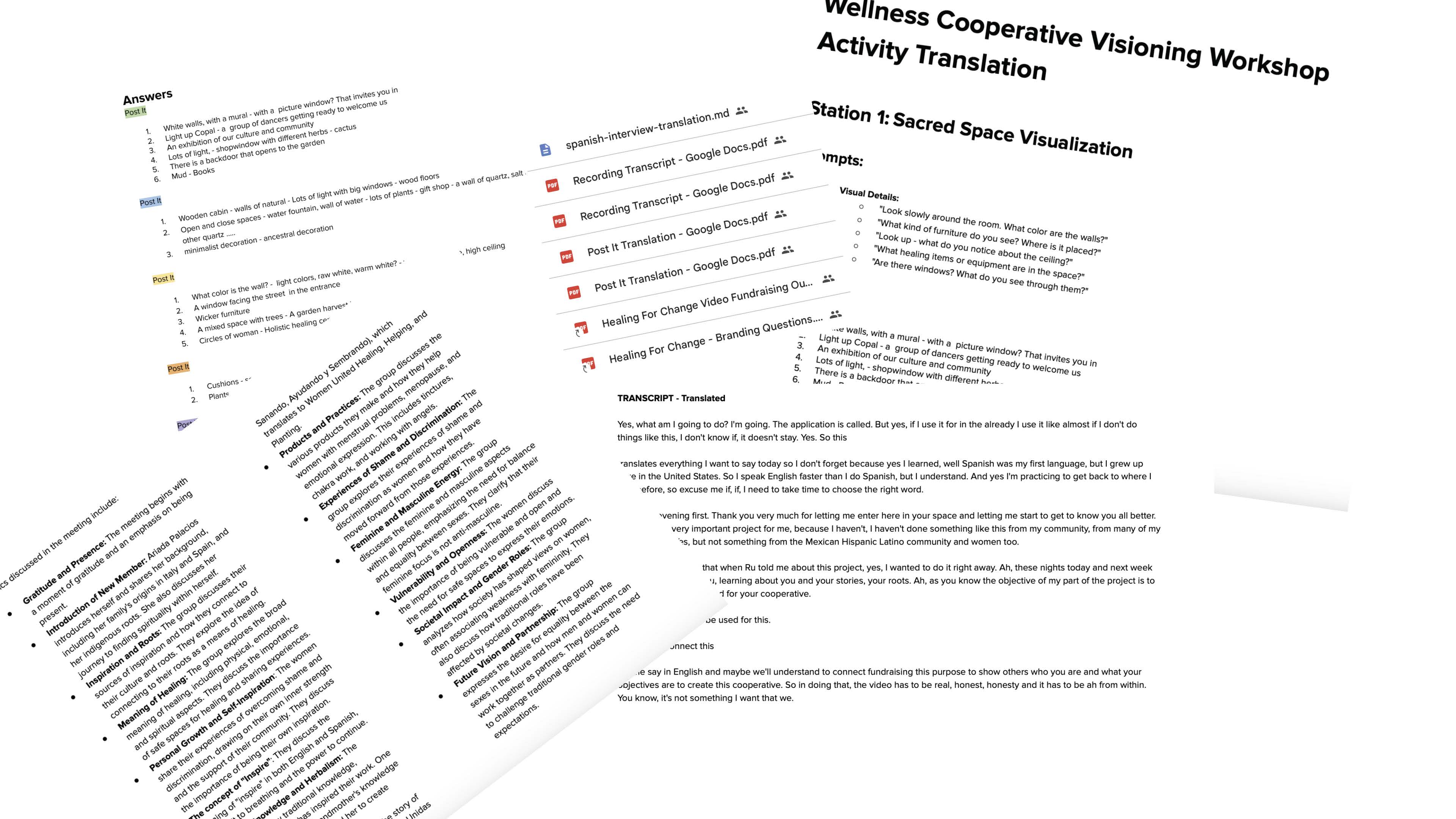
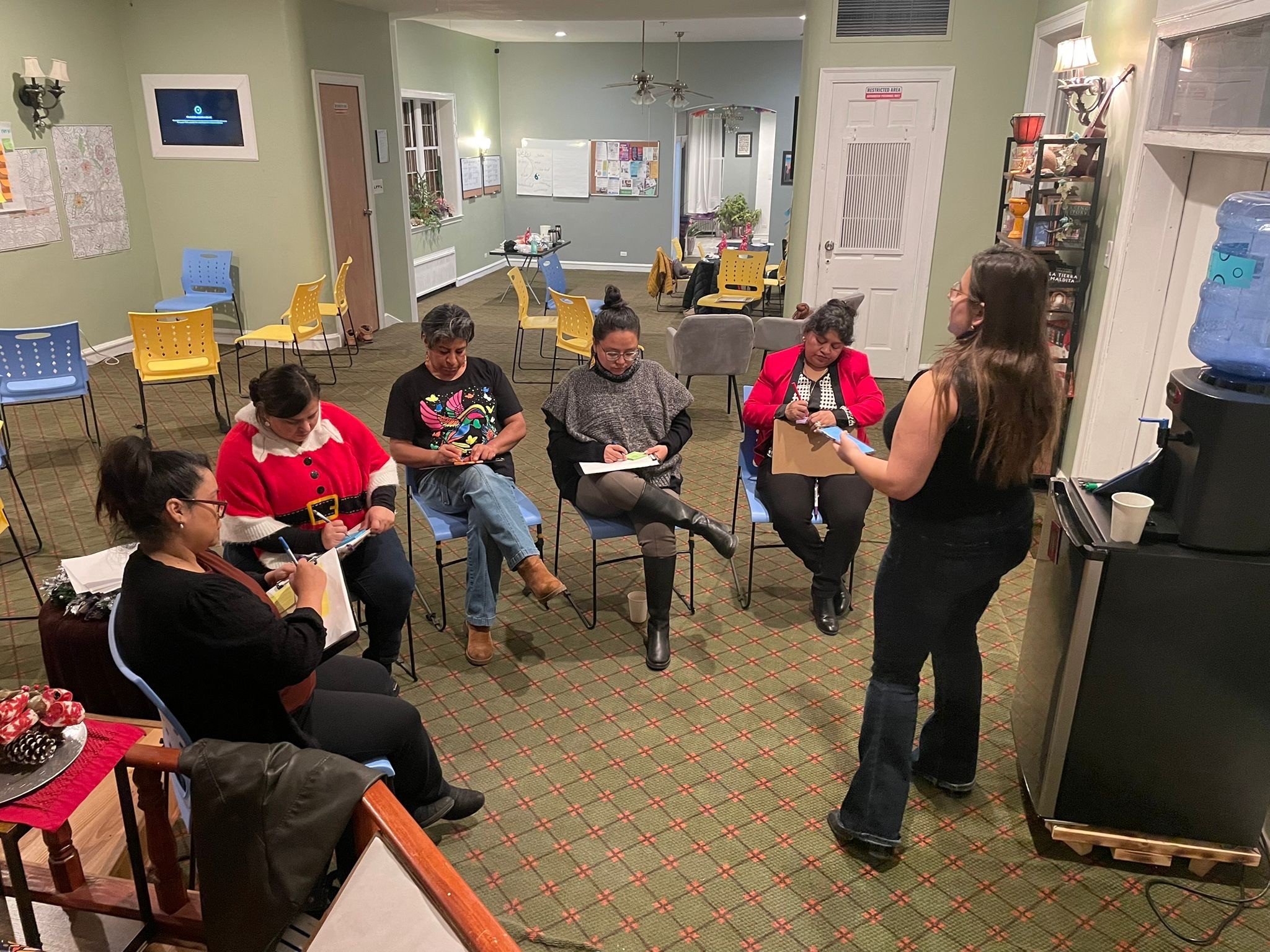
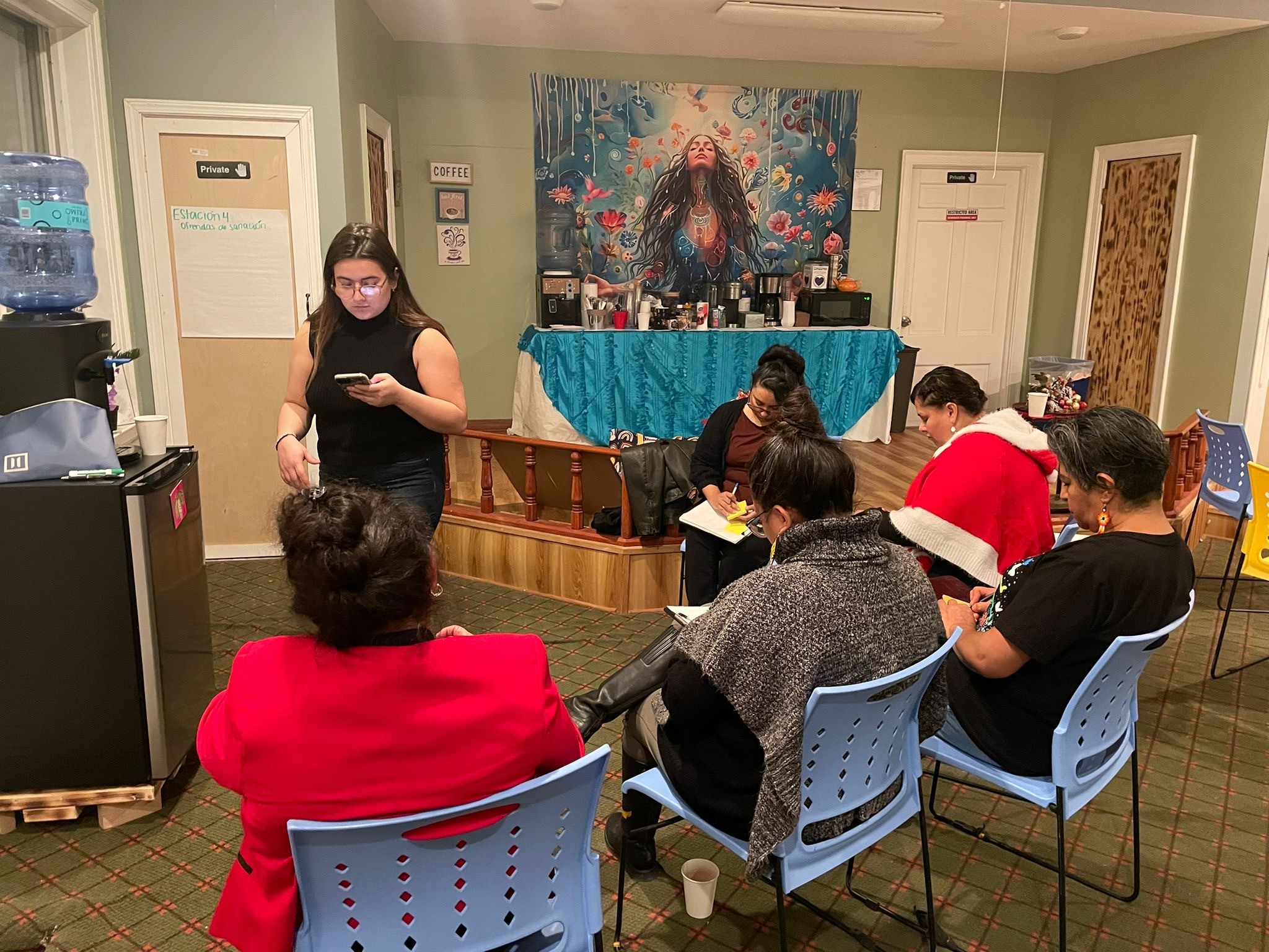
The project began with listening. Through workshops, conversations, collaborative exercises, and customer visioning, the work focused on understanding who Tlatlayeni was, what united the cooperative, and how they hoped to show up for their community.
The project began with listening. Through workshops, conversations, collaborative exercises, and customer visioning, the work focused on understanding who Tlatlayeni was, what united the cooperative, and how they hoped to show up for their community.
The material gathered through discovery was then synthesized with the support of AI, helping surface patterns across the conversations, exercises, and written responses. In addition to written synthesis, podcast-style audio summaries were created so the team could listen back, reflect, and engage with the insights in a more accessible way.
The material gathered through discovery was then synthesized with the support of AI, helping surface patterns across the conversations, exercises, and written responses. In addition to written synthesis, podcast-style audio summaries were created so the team could listen back, reflect, and engage with the insights in a more accessible way.
As the conversations unfolded, recurring themes began to surface around healing, ancestry, resilience, community, breath, and renewal. These ideas created the foundation for the next phase of research, where the shared language from discovery was explored through cultural symbolism, historical references, and visual meaning.
As the conversations unfolded, recurring themes began to surface around healing, ancestry, resilience, community, breath, and renewal. These ideas created the foundation for the next phase of research, where the shared language from discovery was explored through cultural symbolism, historical references, and visual meaning.


Symbolic Research
Symbolic Research
The themes uncovered during discovery became the beginning of a deeper research process. Rather than moving directly into visual exploration, the work looked more closely at the cultural and symbolic meaning behind the ideas that kept resurfacing.
The themes uncovered during discovery became the beginning of a deeper research process. Rather than moving directly into visual exploration, the work looked more closely at the cultural and symbolic meaning behind the ideas that kept resurfacing.
Breath, maize, trees, leaves, maps, ancestry, and renewal each carried their own significance. Ihiyotl connected breath to life force, speech, healing, and sustenance. Maize represented nourishment, ceremony, and ancestral memory. Trees suggested connection between worlds, protection, and renewal, while leaves became a metaphor for story, movement, medicine, and community.
Breath, maize, trees, leaves, maps, ancestry, and renewal each carried their own significance. Ihiyotl connected breath to life force, speech, healing, and sustenance. Maize represented nourishment, ceremony, and ancestral memory. Trees suggested connection between worlds, protection, and renewal, while leaves became a metaphor for story, movement, medicine, and community.
These references created a symbolic foundation for the identity. Together they revealed an interconnected network of ideas centered around nourishment, healing, community, resilience, and renewal. Understanding those relationships helped shape the visual language that followed.
These references created a symbolic foundation for the identity. Together they revealed an interconnected network of ideas centered around nourishment, healing, community, resilience, and renewal. Understanding those relationships helped shape the visual language that followed.
The work was informed by meaning rather than aesthetics alone.
The work was informed by meaning rather than aesthetics alone.
The work was informed by meaning rather than aesthetics alone.
The work was informed by meaning rather than aesthetics alone.


Enchanted Pōctli

Chantico Clay

Sacred Sagrado

Jade
Logo Exploration
Logo Exploration
Typography became an important extension of the identity rather than a separate design decision. Custom letterforms were developed to carry visual cues from the research itself, subtly incorporating the flowing qualities associated with breath and movement. This allowed the wordmark and symbol to feel connected, creating a more cohesive identity system rooted in the same ideas that informed the mark.
Typography became an important extension of the identity rather than a separate design decision. Custom letterforms were developed to carry visual cues from the research itself, subtly incorporating the flowing qualities associated with breath and movement. This allowed the wordmark and symbol to feel connected, creating a more cohesive identity system rooted in the same ideas that informed the mark.
Color was approached in a similar way. Rather than selecting a palette based solely on aesthetics, colors were drawn from themes that repeatedly surfaced throughout the research, including healing, nourishment, ancestry, and renewal. Each color was given a name connected to its symbolic meaning, extending the narrative beyond the logo itself and into the broader identity system. Together, the typography, color, and symbol formed a visual language grounded in the same cultural references and values that shaped the cooperative.
Color was approached in a similar way. Rather than selecting a palette based solely on aesthetics, colors were drawn from themes that repeatedly surfaced throughout the research, including healing, nourishment, ancestry, and renewal. Each color was given a name connected to its symbolic meaning, extending the narrative beyond the logo itself and into the broader identity system. Together, the typography, color, and symbol formed a visual language grounded in the same cultural references and values that shaped the cooperative.
A Breathing Brand
A Breathing Brand
Tlatlayeni was supported with a shared guidelines library, helping protect the meaning and consistency of their brand as it continued to grow.
Tlatlayeni was supported with a shared guidelines library, helping protect the meaning and consistency of their brand as it continued to grow.


Every idea begins with a point.
Every idea begins with a point.
Every idea begins with a point.
Let’s shape what comes next.
Let’s shape what comes next.
Let’s shape what comes next.
Book a Session